Category Archives: printing techniques

A Child’s Garden of Images by Roger Duvoisin

Well, while I am waiting for production to continue on Where Lily Isn’t (the designer at the publishing house just left, so the search is on for a replacement, *sigh*…) I will entertain both you and myself by looking through the books in my kid lit collection.

Today I pulled out a book that was a gift from a friend – A Child’s Garden of Verses by Robert Louis Stevenson, illustrated by Roger Duvoisin (The Heritage Press: 1944). Lucky for me she had two in her collection.

I have a few books illustrated by Duvoisin (you may know his work from his 1950 book Petunia). His drawings are joyful and loose, sometimes on the edge of silly. His illustrations are from the era when colored images were prepared for printing by separating them manually into multiple plates (as would be done in traditional printmaking). The plates were then printed in individual ink tones, usually including a yellow, a red, a blue or green, and black. The results create an appealingly limited palette of graphic shapes and patterns. I am a fan!

Below from ‘Foreign Lands’:

I love how the girl’s feet exit the top of the image in ‘The Swing’, although the flattened perspective makes me worry a bit for her safety on the way down:

‘The Cow’: Perhaps a precursor to Petunia?

‘Travel’:

‘My Ship And I’:

The illustrations for the book aren’t all in color. There are many lovely black and white images, such as this for ‘The Little Land’:

and this for ‘My Shadow”:

Also for ‘Little Land’:R Duvoisin-Childs Garden of Verses-The Little Land 2

‘Autumn Fires’: Do we not feel the loss of summer looming?

‘To Minnie’: That is some rug!

For all you picture book folk – ‘Picture Books In Winter’:R Duvoisin-Childs Garden of Verses-Picture Books In Winter

And finally, a peek under the jacket cover:

Perhaps for my next post I will show more of Duvoisin’s work. It is worth exploring further.

In The Study Rooms at the V & A (Part III)

w-crane-babys-bouquet-ringel-tanz-sketchWhen I wrote my last post, I had just left London for Seattle. I am over my jet-lag now and my cultural re-entry is underway. It is great to reconnect with friends and family on the same continent, but I DO miss London. What a richly laden place that is.

And the Victoria and Albert is a richly laden museum. As I mentioned in my first post about my visit to the V & A Museum’s Prints and Drawings Study Rooms, one of the objects I viewed that day was the original volume of Walter Crane’s designs for The Baby’s Bouquet, a companion to his earlier Baby’s Opera. Fifty-six pen and watercolour drawings in a bound, 7 1/4″ X 7 1/2″ booklet – created in the 1870s and published in 1877.

w-crane-babys-bouquet-cover-sketch

In my notes from that day I wrote,

OMG! This is the most beautiful thing ever!!! I can’t believe I am here touching this! I can’t believe it’s allowed!

Clearly, I was thrilled. It is truly exquisite. The illustrations appear to have been made contiguously in the bound book, with no correction fluid or paste-ins. There are some suggestions and notes for the engraver. Inside the cover there is a mini-mock up with a few endpaper ideas.

w-crane-babys-bouquet-inside-cover-sketch

w-crane-babys-bouquet-inside-cover-open-sketch

Preliminary pencil drawings can be seen under the watercolour. Crane’s touch with the brush (or pen) is light and confident. It is as though he never had a moment of doubt about any aspect of what he was doing.

W Crane-Little Cock Sparrow-sketch detail.jpg

I was curious to see a published edition of the book for comparison, but wasn’t able to until recently, when I joined Julie Paschkis and Jennifer Kennard on a book field trip to the University of Washington Rare Books Library. Jennifer made an advance appointment for us, and I requested to see their copy of an 1879 edition.

p1070129

The published version is beautiful as well, but very different from the original. Engraving was the technique that allowed illustrations to be printed with the press technology of the time. Each colour was cut into a different plate, then inked and printed separately.

Watercolour washes have variations in value and tone that are made when the paintbrush moves across the surface of the paper with varying amounts of pigment. Wood engraving is a form of relief printing from a wood block. What isn’t meant to print is cut away. A thin layer of ink is then rolled across the surface of raised lines. The image is transferred to paper through the use of pressure. Watercolour and wood engraving are extremely different techniques.

The engraver, Edmund Evans, based his prints on Crane’s drawings, but made many artistic additions of his own. I don’t know if Edmunds was someone Crane knew personally and worked with repeatedly, but one would think so. Crane must have been able to trust him to take his creation and transform it so dramatically. Either way, both books exemplify two artists and masters of their craft. I will show photos of Crane’s originals along with the prints so you can compare for yourself.

w-crane-babys-bouquet-frontespiece-sketch

w-crane-babys-bouquet-frontespiece

w-crane-babys-bouquet-title-pg-sketch

w-crane-babys-bouquet-title-pg

w-crane-babys-bouquet-contents-sketchw-crane-babys-bouquet-contents

w-crane-babys-bouquet-the-little-disaster-sketchw-crane-babys-bouquet-the-little-disaster

w-crane-babys-bouquet-buy-a-broom-sketchw-crane-babys-bouquet-buy-a-broom-sketch-detailw-crane-babys-bouquet-buy-a-broom

Some images are more different than others. Who do you think decided to add the target and turn the boy’s head?

w-crane-little-cock-sparrow-sketchw-crane-little-cock-sparrow

This image appeared in the original version, but was eliminated in the final.

w-crane-carrion-crow-sketch

This image was changed in format to become a two-page spread with a full-page image. Crane’s handwritten notes show below the drawing.

w-crane-babys-bouquet-the-north-wind-and-the-robin-sketchw-crane-babys-bouquet-the-north-wind-and-the-robin

w-crane-old-man-in-leather-sketchw-crane-old-man-in-leather


w-crane-babys-bouquet-the-four-presents-sketchw-crane-babys-bouquet-the-four-presents-sketch-detail

Some colours deepen from the original sketches.

w-crane-babys-bouquet-the-four-presents

Some palettes change more dramatically.

w-crane-babys-bouquet-gefunden-sketchw-crane-babys-bouquet-gefunden

In this piece, you can see how a fairly simple painted background…

w-crane-babys-bouquet-gefunden-sketch-detail

…becomes more complex when transformed into an engraving. There are four blocks cut and printed – yellow, red, blue and black. Notice how finely the lines are carved.

w-crane-babys-bouquet-gefunden-detail

w-crane-babys-bouquet-looby-light-sketchw-crane-babys-bouquet-looby-light

I think you will agree that both the drawn and painted sketches and the cut and printed final illustrations are beautiful. I leave it to you to decide which you prefer. You can dance Looby Light while you think about it.


Happy 318th Birthday, Hogarth

William Hogarth, one of London’s most beloved artists, spent his later years in Chiswick (pronounced Chizzick), the area of London where my family and I are living now.

Hogarth statue

There is a statue of Hogarth on the Chiswick High Street not far from our house.  November 10th was his birthday.

Hogarth wreath

He is clearly Chiswick’s favorite 18th century celebrity.

Hogarth is another artist who seems like six or eight people compressed into one. In addition to being a very successful portrait painter, he was an engraver, publisher, caricaturist, satirist, social reformer, foster parent, storyteller, and writer. He also put through the first copyright legislation and was a founding Governor of the Foundling Hospital.

Hogarth and dog selfie detail

A few weeks ago I took a tour of Hogarth House in Chiswick, where Hogarth and his family lived from 1749 onward (Hogarth and his wife had no children of their own, but they fostered foundlings) and which is now a museum.  Hogarth bought the house as a quiet country escape from the hectic center of London where he had lived and worked until then. Now the house sits on a busy thoroughfare.

Hogarth House exterior

Hogarth was able to make a good income from his artwork. He was commissioned for portraits and sold paintings as well as engravings and etchings based on his paintings.

Engraving tools Hogarth engraved plate

W Hogarth-The Distrest Poet  W Hogarth-The Enraged Musician

Hogarth is best known for his serial works that mix moralist tales with social commentary and wit. He was keenly observant of human behavior in all it’s embarrassing and entertaining detail. He dealt with topical subjects like politics as well as perennials like sex, crime, cruelty, corruption and hypocrisy. He must have been a somewhat uncomfortable person to be introduced to. He would have had a ball with the latest American presidential debates.

W Hogarth-The Laughing Audience

A Harlot’s Progress (1731) and A Rake’s Progress (1735) are two of his most famous sequential series. Both tales depict the sorry end that can come from being deceitful, vain, selfish, greedy, lustful, and foolish. And from hanging with the wrong crowd.

W Hogarth-Detail from Rakes Progress plate 8

Hogarth is a master at portraying facial expressions. In the detail from A Harlot’s Progress plate 6 below, the clergyman is feeling up the skirt of the woman next to him at the Harlot’s funeral. She doesn’t seem to mind.

W Hogarth-Detail from Harlots Progress plate 6

Every millimeter of space in Hogarth’s pictures include details that reinforce the story being told. Below is a bit from the border of the final scene in A Rake’s Progress. The setting is an insane asylum, evidenced by the fact that an inmate has used the leather from a bible to mend a shoe.

W Hogarth-bible shoe leather Detail from Rakes Progress plate 8

Strolling Actresses In A Barn (1738) is flush with activity from all corners. Two neglected impish youngsters in devil costumes are fighting over their mother’s tankard of ale while she poses and loses her knickers.

W Hogarth-Strolling Actresses in a Barn-1738

W Hogarth-Strolling Musicians In A Barn detail

Elaborate details like these remind me of images I loved from the early Mad Magazine comics (that I wrote about here before). William M Gaines and Will Elder must have been influenced by Hogarth. He is the great-great-great-grandfather of modern comic strip cartoonists.

But Hogarth wasn’t only interested in showing the foibles and flaws of society. He also wrote and published a book The Analysis of Beauty (1753), to share with both artists and commoners alike what he saw as the six principles of aesthetics: fitness, variety, regularity, simplicity, intricacy and quantity.

Screen Shot 2015-09-20 at 9.49.55 PM

Screen Shot 2015-09-20 at 9.50.24 PM

W Hogarth Principles of Beauty 1 detail

Hogarth died in Chiswick in 1764 and is buried in a nearby churchyard. I’m grateful to be able to see London through his eyes. The city has changed considerably, but humanity hasn’t so much.

Max Lingner: Künstler des Volkes

Max Lingner-mural detail 1Details draw me in. I can easily miss the forest (or wood, as they say here in England) for the trees. But, sometimes a detail fascinates me so much that I’m led to research its entire continent.

Last Spring I visited Berlin. On the side of the former House of Ministries building, (originally built for the Nazi Ministry of Aviation), there is a 60 foot long mural by German artist and illustrator Max Lingner (1888 – 1959). Lingner worked on the mural from 1950 to 1952. It was commissioned by the Prime Minister of the German Democratic Republic (GDR) who had Lingner revise the drawing five times. Lingner’s original concept centered on the family. The final image looks stiff and militaristic by comparison. Apparently Lingner hated the final version, and refused to look at it when he went past.

Max Lingner-mural in situ

Nonetheless, the mural fascinated me. I didn’t take in the image in its entirety (which, granted, is hard to do as it is placed behind pillars), but I spent a long time studying how the image was built with layers of line, color and texture. (The image set into the plaza in front commemorates the Uprising of 1953.)

I took a number of photos so that I could examine the images further when I returned to London.

Max Lingner-mural detail 2 Max Lingner-mural detail 3

(I don’t have a thing for shoes, it’s just that the feet of the figures were at eye level and easiest to photograph up close.)

Max Lingner-mural detail 6

What intrigued me was the use of stenciling through a grid structure to achieve tonal variations. I often use stencils in my work, (it’s a printmaking technique, after all) and Lingner has inspired me to experiment with similar techniques.

Since visiting Berlin, I have been trying to gather more information about Lingner and the materials he used. Unfortunately, there is not much information available in English, probably because he was a communist artist working in post-war East Berlin.

I have purchased a number of books from Amazon.de, all in German. I studied German for one year in college. This gives me just enough German to (sort of) figure out what they are talking about, but not enough to know what they are actually saying. Translating online is a slow and inaccurate process, but here are some of my favorite pictures from the books I have collected.

Below is one of the initial paintings for the House of Ministries mural (in two parts because of its length).Max Lingner-preliminary for Haus der Ministerian-LMax Lingner-preliminary for Haus der Ministerian-R

This is the final painting that was then transferred to tiles and installed by a team of artisans from the Meissen porcelain factory.Max Lingner-sixth version for Haus der Ministerian-LMax Lingner-sixth version for Haus der Ministerian-R

This painting was for another mural: ” Construction in Germany.”Max Lingner-Aufbau in Deutschland-72

“Woman and Child,” Madrid 1937.Max Lingner-Mutter und Kind-Madrid 1937

“The Starving Child,” 1948.Max Lingner-Das hungerude Kind

Cover for exhibition catalogue, “Eigentum des Deutschen Volkes” (tr. Ownership of the German People?)Max Lingner-Ownership of the German people-exhibit cover

From the series, “As it was,” 1958Max Lingner-So War Est

“Peasant with wide eyes,” 1950-54. I believe Lingner was a colleague of Käthe Kollwitz.Max Lingner-Bauer mit aufgerissenen

Lingner also illustrated at least one book for children. This is the cover for The Goatherd, by Henri Barbusse. Max Lingner-Der Ziegenhirt-Jacket

I haven’t figured out the whole story yet. It’s something about a princess and a goatherd and forced labor and dancing and the future … for children aged six and up.

Max Lingner-Der Ziegenhirt-Alle grossen Gebaude Max Lingner-Der Ziegenhirt-Ach sagte die Prinzessin

Someday I hope to learn more about Max Lingner’s work. Maybe I will get lucky and someone will publish a book about Lingner in English.  In the meantime, Ich studiere, um mein Deutsch verbessern…


New and Old

Moving to London has brought new challenges, which is in part why the move appealed to me.

But moving someplace new doesn’t mean you don’t seek out the familiar.

LPS view to canal

Last October I visited the London Print Studio on the recommendation of a friend. Perhaps it was the scent of burnt linseed oil, but I immediately felt at home.

The studio offers classes and studio work sessions for printmakers. It also has a gallery space and small shop.

I signed up for a screenprint workshop. It was good. I asked if they could use any volunteer workers (I figured I might as well make myself useful while I’m here). They said Yes.

I met with the LPS founder and director John Phillips and the operations manager Nadia Yahiaoui. They asked me to put together a print media display for their upcoming 40th anniversary exhibit, “Printopia – How and Why Artists Reproduce.

In addition to showcasing all of the techniques the studio provides equipment and materials for – letterpress printing, etching, screenprinting (or silkscreen) and stone lithography – John also asked me if I would like to produce a print to demonstrate each technique in the display.

Well sure. I am still fairly new to silkscreen, I haven’t made an etching since the early 80s, and I’ve never done stone litho. But hey, why not?

Fortunately, I had help from many, but especially from the LPS Print Studio Coordinator, Darren van der Merwe, who was kind and patient enough to give me an very quick intro to stone litho.

Darren

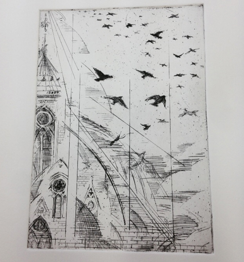
To start with, I had an excerpt from Victor Hugo’s Notre Dame de Paris that John  planned to use for the letterpress demo. The piece is from the chapter, “This will destroy That. The Book will destroy the Edifice.”

Letterpress Hugo quote for demo

I decided to interpret (illustrate) this quote in the three remaining media, adapting the image to suit each technique.

I started with etching.This is the first state (proof stage) of the image done freehand on hard ground.

etching plate state 1

I then moved on to the stone lithography piece. This involves drawing on a slab of finely grained limestone mined from Jurassic Era deposits. A fresh stone has a surface Darren describes as “like velvet.” It instantly absorbs any grease you apply, including that from your skin. Wherever the grease is absorbed will show up on the final print. If you mess up, the stone has to be ground down. Grinding down a stone takes hours. I didn’t want to mess up. It was a bit intimidating.

After drawing on my stone for a while it occurred to me that I am not really a line-work person. I am much more comfortable working with form, which is probably why I mostly work in relief printing where I can cut out shapes and leave the line-work to my preliminary drawings. My litho image was looking very timid.

I went looking for Darren, who suggested I could move some of the line around with tusche and even remove some of what I had done with mineral spirits.

That’s when things got really messy but much more productive. I began rubbing out lines, cutting out stencils (shapes) and splattering tusche. I got so carried away I dissolved some of the gum arabic that Darren had laid down to mask out the border areas. It doesn’t resemble what I started out with, but I am relieved and pleased with the end result. It looks like I meant to do whatever it was I did.

litho stone for demo

I then proceeded to add aquatint to my etching plate. However, I misread the handy timing guide posted in the acid room. The sign showed progressive darknesses of aquatint with a guideline that read; 5″,  10″,  15″, etc.  I thought  ”  meant minutes, but it wasn’t till I had dunked my plate in the acid four times, for a total of sixteen minutes, did I realize that  ”  meant seconds. #@$%&

So I ended up with a very dark plate, but at least the print doesn’t look timid!

etching state 2

That left the silkscreen image, which I had no choice but to create digitally and send to Darren to transfer to the screen and print.

silkscreen for demo

silkscreen for LPS show

Darren printed everything for me as I had to leave town for two weeks in the middle of the exhibit preparations. I came back with barely enough time to build the displays before the opening.

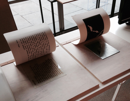
John had purchased thin metal sheeting imagining it could be sandwiched between the printed images and a blank sheet of paper to create the effect of the prints “magically” lifting off the plates. I was skeptical. I tested it out. It worked beautifully.

letterpress etching demoslitho + silkscreen demos

I assembled the displays, and now I can add display-building to my list of new skills.

I had fun. I problem-solved. I got to work with a great group of art people. I created my first (and perhaps only) stone litho image. I made something useful. The LPS gained an extra pair of hands for a few weeks and I felt welcomed. I’m looking forward to the next challenge.

Editing

Screen Shot 2014-08-22 at 11.14.41 PM

“Boldly and bluntly simplify the subject so as to reveal its true essence.”
– Kiyoshi Saito, (1907-1971)

I have spent the last three months preparing to move from Seattle – where my husband and I have lived since 1986 – to London, England. I fly out at the end of the month. These last few weeks have been a lesson in letting go.

I have been going through everything we own to clear the house for incoming renters. I have picked up every object, pondered it, and decided whether to ship, store, or discard it.

This has gotten me thinking about the process of editing.

Editing your life is like editing your own personal narrative. I am an accumulator by nature, but not a collector, nor a hoarder. The difference is that I enjoy getting rid of stuff, if only to clear the clutter to let the better bits shine.

When I am writing I follow the same process. I have less confidence in my words than my imagery, so I don’t mind keeping my words to a minimum. If I can prove to myself that every word has a reason to be there, I feel I have created the cleanest, least cluttered prose possible. It’s less risky that way. Clear the knick-knacks off your literary shelf.

Screen Shot 2014-08-22 at 11.15.36 PM

In my artwork I am constantly editing and revising. I strive to follow the words quoted above. Kiyoshi Saito is a contemporary Japanese woodblock artist and a master of selective visual editing in his imagery. Choosing what details to include and what to leave out reveals the aspects most elemental to an idea.

Get rid of the lesser bits. Pack them away or let them go. Only set your choicest pieces out for display.

My next post will be written from the UK. Just think of me as the Books Around The Table foreign correspondent for the foreseeable future. I look forward to exploring new territory and sending back the best bits to share with all of you!

And now, back to packing!

Screen Shot 2014-08-22 at 11.17.17 PM


A Tale of Two Foxes

My fox sisters celebrated a new edition in May and it seems like a good time to tell their story.

The first, eponymous, Zelda and Ivy book was published by Candlewick Press in 1998: three short stories about two fox sisters in one picture book format. Both the text and illustrations seemed to drop into my lap: gifts. But with further thought, I realized this material had been trying to become a book for a long time.

We all experience moments when life is larger than usual, moments full of emotion and humor that we recognize as the stuff of story. I gathered a critical mass of such times from childhood home movies and conversations with my sibs. I wanted to make a picture book that carried our growing-up experience: our neighborhood parades, and fairy dust and, maybe most importantly, our relationships. I am the middle of five children. I know what it is to be a bossy, imaginative big sister and an adoring, gullible little sister. I was pretty sure sibling rivalry could fuel the drama.

2.fam.photo620

I first worked with this material in a project called Summer Shorts. Here’s the dummy.

3.coverSumSh

It included four short stories about a family with five human children. It made the rounds at publishers and was roundly rejected. Years passed while I sold other projects and got started in the picture book world.

Meanwhile, Pierr Morgan, a NW illustrator, showed me this cool medium called gouache resist (directions: http://www.lmkbooks.com/fun/gouache.php). I liked how the reds popped. Why not revisit that sibling rivalry material – only with fox characters? I simplified, reducing the cast to two.

4.UrZ&Iart619

From their debut at critique group, these characters seemed to have the juice. When Zelda and Ivy was published,  it received lots of starred reviews and SCBWI’s Golden Kite honors in illustration and text.

1.coverZ&I

I was invited to do a sequel. Then a third.

5.coversZ&IbndandXmas

When the fourth book, Zelda and Ivy The Runaways, came out in 2007, it had a leaner look. Candlewick’s marketing department had advised these stories belong in the early reader canon – thus we downsized to the standard 6 x 9-inch ledger size. That year ALA chose it for the Geisel Award. It was the same year my friend Kirby Larson won the Newbery for Hattie Big Sky. We were both in the ballroom in downtown Seattle when our awards were announced. Pretty exciting.

6.coverRunaways

Two more Zelda and Ivy titles have followed, and the earlier ones were reformatted from picture book to ledger.

7.coverZ&IKeepSec

By the time I got to the sixth book, I knew Zelda and Ivy’s world as well as my own.

8.coverBigPic

As of May, all titles six are officially part of Candlewick’s Sparks series for early readers; each published as a slim paperback that fits easily into the backpack of a young reader.

9.backpack6

Revisiting Another Realm

“Birds and Woman’s Face”-Kenojuak

I visited my parents recently, and while I was there I spent some time looking through the books on their shelves. Most of them are the same books I grew up looking at when I was a kid, sitting in the living room of our house in Southern California. It was comforting to peruse them again, like looking at old family photo albums.

Some of my favorites are from my mother’s collection of Eskimo graphic art books (the proper term is Inuit, but her books are all from the pre-pollitically correct 1960s), and wouldn’t you know, these images that I’ve always liked so much were made using printmaking techniques – first introduced to the Inuit in the late 1950s.

“Two Men Discussing Coming Hunt” -Kavagawak

There is a great deal of humor in these images, but also great power and beauty. They are a vision into another culture’s world view – with high contrast and a wonderful use of negative space. Perhaps this is what happens when you live in a realm of ice and snow.

“The Arrival of the Sun” -Kenojuak

The Enchanted Owl-Kenojuak“The Enchanted Owl” -Kenojuak

This one below reminds me of Peter in The Snowy Day, by Ezra Jack Keats (one of the most perfect children’s books ever made).

‘Seal Hunter” -Niviaksiak

And looking at these books again, I realize this art likely influenced the direction my own work eventually took, although I didn’t see it until now.

“Polar Bear and Cub on Ice” -Niviaksiak

Image for Hello, Arctic!, 2002

A New Word: Solastalgia

I like words.  That’s a condition endemic to writers (along with an obsession with stationary supplies) but I don’t think it comes out in quite the way people imagine.  It’s not like I love a thesaurus, which, if used with too much enthusiasm, can produce writing  filled with inflated diction. No, writing like that, all tarted up, is not what loving words is about, at least not in my opinion. I don’t make lists of my favorite words and then look for random places to insert them in my writing. What I’m more interested in, in terms of words, is where they come from – their etymologies and how they made their way from one part of the world and one language group to another part of the world altogether, and how they changed as they moved through time and space. The Oxford English Dictionary handles etymologies brilliantly – I’ll take the OED over a thesaurus any day

Since I love words and their complicated provenance, it makes sense for me to be interested in neologisms – newly-invented words. The other day my sister told me about this one: Solastalgia. It looks a little like something that might send you to bed with the sniffles, or maybe like something in a 19th-century novel when the heroine requires “mustard plasters.”

Actually, the word “Solastalgia,” coined in 2003 by Australian philosopher Glenn Albrecht, is a condition similar to nostalgia, with a twist; it occurs not when you are far from home and long to return, but when you are still home and feel the loss of home due to the changed nature of the landscape or environment in general. My sister and I are now convinced we suffer from this condition, since we live in a world so changed from what we remember – we are constantly looking for the landmarks that have disappeared, we keep longing to repair the damage and restore a well-loved spot to it’s former health.

Take Elger Bay, for example, midway down Camano Island in Puget Sound, with its old waterfront cabins from the 30’s (no indoor plumbing, no electricity) replaced now by 6000-square-foot mansions. Signs have gone up saying “Private Beach, Keep Off.” The trees are gone, eagles are gone, driftwood has been replaced by cement bulkheads. The cabin my great-grandmother built with her husband is gone. But what we’re feeling isn’t nostalgia. We’re not longing for a simpler time. This is the heartache (or “psychoterratic illness”) of searching for a landscape that once was whole and now is damaged. Solastalgia (a mix of the root word solacium, meaning comfort, and -algia, meaning pain.)

I don’t imagine that word will  make it into my writing for children any time soon. But what an interesting word it is.  Also, terrible.  I might try writing a story about a girl who is homesick even when she’s home.

All because I heard about a new word and looked it up.

[ADDED NOTE: The Australian blog mentioned in the comments below – Healthearth – has a wonderful explanation of solastalgia – click here for a link. This is the blog of Glenn Albrecht, who first developed the concept of solastalgia and came up with a name for it.]

Beauty In Limitations: A Printmaker’s Perspective

Denslow’s Mother Goose, W W Denslow, 1901

I have been thinking about limitations lately.

Like illustrations from old picture books before four-color photo-processing became the norm. The ones I’ve accumulated are mostly from the 40s and 60s and they seem have been printed that way to keep production costs down. An economy of expense leading to an economy of style.

Those images have a particular quality that I’ve always loved. The simplicity of an image made by building layers of color. The opposite of slick. Perhaps that is why I was drawn to printmaking. Printmakers are inordinately fond of process and tools you have to sharpen by hand. We think in layers. We are to painters what typesetting is to Microsoft Word.

Kees & Kleintje, Elizabeth Enright, 1938

Kees &Kleintje, Elizabeth Enright, 1938

Not that images like these were simple to produce. Each color had to be created on a separate overlay in black (or the photo equivalent). Often the print run was limited to two or three colors so overlapping was used to create more.

When you have to do the color separation yourself with specified colors, you have to create the mechanicals whilst thinking ahead to what the image might look like. You won’t know for sure till the finished page comes off the press.

Kees, Elizabeth Enright, 1937

The above images were printed with red, yellow, blue and black inks. The oranges and greens and other tones come from overlapping the transparent inks and using screen tones of those four colors. I know it sounds like CMYK, but the difference is that the color separations were all done by hand. There was no full-color image to start with ahead of time.

Rather than confuse you further by describing what I’m talking about, I will show you an example. The spread below demonstrates how three separate images overlap to produce a multicolor picture.

Woodcuts & Woodengravings: How I Make Them, Hans Alexander Mueller, 1939

When artists work under these limitations, I think a kind of magic can occur. I like the happy accidents that happen when colors overlap and registration gets a bit off. Some people would argue that you can get the same effect more easily using a computer, but there is too much control — down to the pixel — with digital media. There is no room for chance or Happy Accidents. The only accidents I can think of involving computers involve spilled liquids, and they are NOT happy.

Pierre Pidgeon, Arnold Edwin Bare, 1943

Ilenka, Arnold Edwin Bare, 1945

Mrs. McGarrity’s Peppermint Sweater, Abner Graboff, 1966

Josefina February, Evaline Ness, 1963

James and the Giant Peach, Nancy Eckholm Burkert, 1961

So how does all this inform my work?

“Daphne’s Hand”, Margaret Chodos-Irvine

Well, like I said, I’m a printmaker, and printmaking isn’t the most practical illustration technique in which to work. Nonetheless, it is worth it to still leave room for chance in my work. Images like these remind me that working within limits can have positive, even beautiful, results that could not be achieved in any other way.